


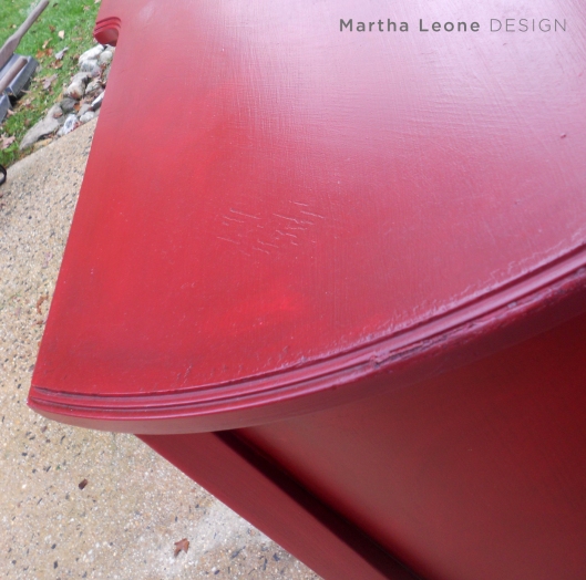
By far, this is the heaviest piece I have ever transported to my garage. Wow. It’s huge. This post will give detailed info on how I painted it. For me, it’s important to try something new with each piece of furniture. Whether it’s a new paint color, new product or technique…. it’s gotta be new. As artists, we stay fresh when we introduce something new with each piece. We learn, grow, and offer something unexpected to our friends and customers. Last note: I didn’t change out the knobs although I didn’t like these… too many of them to incur the cost.
Goal
Practice glazing and staining the painted surface to achieve a velvety textured finish. I’m still learning but this piece allowed lots of opportunity to practice.
Materials
– A dark maroon color for the undercoat. This will help get the rich depth of color.
– Behr California Poppy
– Behr Premium Plus Faux Glaze (I WOULD NOT recommend the Valspar (Lowes) brand. It takes forever to dry and is not as easy to work with)
– Minwax Red Mahogany stain
– Minwax Wipe-on Polyurethane
– Lint-free staining pads
– Clean old rags
– a good paint brush
Process
1. Painted one coat homemade chalk paint using the dark maroon color.
2. Applied two coats of a custom tinted glaze using Behr California Poppy and Behr Premium Plus Faux Glaze. Mix these according to the instructions on the glaze container.
3. Applied Minwax stain in Red Mahogany on top then rubbed most of it off using old socks and various rags. This aged the piece and gave it lots of depth of color. The stain slips into the texture that was created by the loose paint brush marks and adds a rich depth to the finish.
4. Finished it by applying two coats of Minwax Wipe-on Polyurethane.
Paint brushing technique
I painted with a loose hand, not in straight lines but in curvey x patterns. I used this application on the paint and glaze. When it came time to apply the stain, there were lots of paint brush “lines” for the stain to settle.


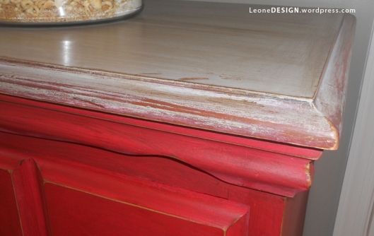
I did another piece using a similar technique but instead of using stain, I used Annie Sloan dark wax. Here’s a detail shot

![]()
or on Facebook
Linking up to:


![]()


 http://www.commonground-do.com/


Pingback: Red Canada. | Martha Leone Design
Beautiful piece! You mentioned that you used a glaze over chalk paint. I purchased some ASCP and was told that glaze would not work because it’s too porous. Is there a special technique you use for this? I love glazing with different colors. Thanks for the advice!!
LikeLike
Hi Julie,
Glazes have worked for me in the past. I’ve tried several techniques in the past: After you paint your piece with ASCP, paint a layer of clear glaze and let it dry. Then, tint your glaze and apply a layer on top of the clear glaze. Wipe away the excess of the tinted glaze. That’s the technique I used on Mammoth Red (the red piece you commented on). Another way to get the glazed look is to paint the piece with ASCP, then wax it with clear wax, then apply a stain with a rag and wipe away the excess. Search my blog for “Unobtrusive Buffet” or “Antique Coco”. I used this technique on both of those pieces. The last think I’ll say is that when you’re applying the stain or tinted glaze, you’ll need to do it in small sections and wipe away the excess immediately. I hope this helps!
LikeLike
Pingback: Antique Coco « Martha Leone Design
Pingback: Antique Coco « Martha Leone Design
Came over from My Repurposed Life. Love this piece. You did a fantastic job on the finish! Question. Why did you use a stain and a glaze, was one not intense enough? I will be using a blue color. I want it too look a tad aged, but not too much as my hubby doesn’t care for that look. Would you suggest using both as you did and since it’s blue, would you suggest one of their blue stains such as Deep Ocean? I’d appreciate any suggestions.
LikeLike
Hi Lisa,
I hope this answer helps: I applied the layers of the tinted glaze to get a translucent layered paint effect… I wanted the layers of paint to create depth of color. I applied the dark stain on top in order to add even one more layer. But more importantly, the dark stain enhances the layers that already exist in the glaze. The dark stain also picked up on my paint brush marks and thus added texture. If I were using your blue color, I would first paint a dark version of that blue, then apply up to two or three layers of the tinted glaze. If you apply the stain to the top, you’ll get a nice aged effect… just make sure to wipe off most of the stain and you’ll get a nice aged look without overdoing the look since your husband doesn’t prefer that. Let me know if you have more questions and thanks for visiting my blog!
LikeLike
B.U.TI.FUL! Found you over at Gail’s MRL!
LikeLike
beautiful buffet and love your paint tips!
gail
LikeLike
I just pinned that to my Paint It board. Love it!
LikeLike
Wow, you did a fabulous job…thanks for linkin’ up to frugalicious Friday!!!
LikeLike
Wow, that is simply stunning! I love the deep rich color!
LikeLike
LOVE the red! Gorgeous!!
Jenna @ rainonatinroof.com
LikeLike
This is awesome! What a pretty piece! Bold and chic! =D
LikeLike
Your piece is just beautiful! How interesting that you used the red mahogany stain. The next time that I paint a piece red I’m going to try that!
LikeLike
I just found your blog through Debbiedoo’s and this piece is great. I have seen some of your pieces before and love them so now I’m following you!
LikeLike
Pingback: Red Canada. « Martha Leone Design
This is so nice, love that you went with red. it will be a bold statement piece in anyone’s home. Great job!
LikeLike
It LOOKS heavy! It turned out great–love that red!
LikeLike
Martha your pieces are amazing! Thanks for dropping by over at Pink Hollybush Designs. I couldn’t believe how big your kids are – it was great to hear from you!
LikeLike
I love red and this piece is gorgeous! You did a wonderful job! I’m your newest follower!
LikeLike
Fabulous!
LikeLike
I love the richness of the red! I’m curious if you prefer this technique over the dark wax technique? Also! I nominated you for the Liebster Award! Check it out here: http://shadesofblueinteriors.blogspot.com/2013/01/liebster-award.html?m=1
LikeLike
Thanks so much Rachel for the nomination and for your kind comment. To answer your question, I prefer the stain over the wax because it’s much easier to spread. However, the dark wax would accomplish two things: it will antique the piece AND protect it in one step. When I use stain to antique a piece, I rub it with wipe-on poly to protect it. That extra step is super easy and protects the piece well. Hope that helps!
LikeLike
This is very beautiful ! I cannot wait to delve in what I have coming up for my blog 🙂 Thanks for the inspiration.
LikeLike
Thank you for your details. I just tried to use Martha Stewart metallic glaze and it did not work like I thought it would. I am going to try the Behr glaze you recommend.
LikeLike
Love,love, love it! Makes a bold statement!
LikeLike