
Tags
annie sloan, annie sloan paint, buffet, coco, console, credenza, dark walnut stain, Furniture Renovation, Painted Furniture

Introduction to Jacobean furniture.
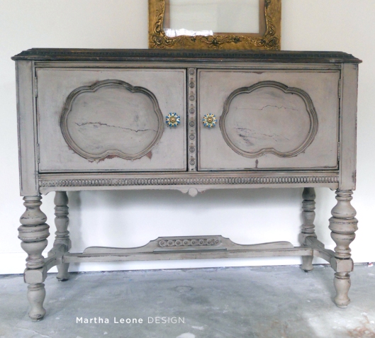
This piece is super unusual and I love it, even with the two cracked front panels. It’s slim and unobtrusive. It can easily slip into a room without bullying its way into the spotlight. It’s a Jacobean buffet. After a bit of research, I discovered that Jacobean furniture, originally coming from England between 1600-1690, was reproduced by colonial americans. Reproductions were made circa 1920. 


The inside was painted the same color used on Knapp Dresser.


Stain build-up in the crevices and a few areas where I didn’t apply it.

What I did with it.
Painted it Annie Sloan Coco straight out of the can (no custom mixes were needed here), then waxed it, then aged it using my favorite technique by using Minwax Dark Walnut stain. I’ll share the tutorial on this aging process soon.

Photography for a staging-challenged artist.
I can paint furniture but staging it for a photograph… yikes. I know what I want but can’t always get it. Just in case you’re challenged like me, I thought I would share some of my attempts at setting up this shot. Although some of my favorite bloggers recommend that it’s important to set up a vignette or story when staging, I prefer to set the piece against the wall with an object or two. Sometimes I’ll add an object that supports the design concept, like with Waterfall. Or I’ll stage it with something unlikely like Accidental Dresser.
If you have a chance, let me know which option you prefer.
Option 1

Option 2

Option 3
Before

![]() or on Facebook.
or on Facebook.
Thank you to Nita from Mod Vintage Life for helping me identify this type of furniture in a recent comment she wrote.
Linking up to these great parties:
http://www.jenniferrizzo.com/


i’m totally with you on the whole staging thing….i want one of these in my entry! you did such a fabulous job
LikeLike
Just saw your feature at Beyond the Picket Fence. I’m in love with this buffet. The knobs are just great!
LikeLike
Great job on this buffet! I just saw it featured over at Primp. I love the detailing on this buffet, and how you’ve transformed it with the ASCP and wax.
I think I like option 1 for your staging. 🙂
LikeLike
A beautiful buffet with sweet details! And sadly, I never get around to pretty furniture styling!
LikeLike
I’m all for bold and bright but sometimes reserved and quiet is the winner. Thanks for sharing your gorgeous piece on BeColorful this week. I adore your work.
p
LikeLike
Hi Pamela, I just happened to be at my computer when your kind comment popped up. Had to respond since I find your blog super fun and can’t get over the blog name… love it. Thanks so much for your comment and for hosting your parties!
LikeLike
Love this buffet! I have one almost identical from my grandmother. She was married in 1910 and it was part of her wedding furniture. I painted it buttery yellow and stenciled sea shells on the panels. It is in my beach cottage and looks so young and alive! I know Grandma would approve.
LikeLike
Beautiful!!! Thanks for sharing!
LikeLike
I love how your buffet turned out! It’s a beautiful piece of furniture. It doesn’t matter to me about staging…some of my most pinned posts have been staged outside up against my privacy fence. 😉 However the lighting seems to be a lot better in #2.
gail
LikeLike
Thanks Gail! Good advice.
LikeLike
Just gorgeous. I am loving the cracked panels. Featuring today, thank you so much for sharing. -K
LikeLike
Very nice! I have a similar buffet and have a similar plan for it (French Linen instead of Coco), but I was hesitant, so I really appreciate seeing how nicely yours turned out!
For what it’s worth, as regards the photographs, I think Option 2 is styled the most nicely — the scale of the paper/frame combination balances the buffet nicely, the blue paper gives a bit of color but doesn’t compete, and the frame picks up the brown/wood tones in the buffet. It could all be hung a little lower, perhaps. But Option 3 has softer lighting.
LikeLike
Thanks Elizabeth for the comment and advice… now ya know why I keep my styling simple… it’s the hardest part of my painting projects. Doesn’t come as naturally as painting for me. Have a great day!
LikeLike
I love it, wonderful choice for color, I would certainly have it in my home!
Came over from Primp Your Stuff.
LikeLike
Gorgeous piece of furniture!
LikeLike
My piece is almost identical. It was my grandmother’s and she gave it to me 46 yrs. ago. She probably purchased it between 1910 & 1915. I recently painted it mellow yellow and it looks so light and “fun” in one of my B & B cottages. It has a whole new life now and I know grandma is pleased!
Karen
LikeLike
That’s a lovely piece now, I love the Jacobean style furniture, very ornate and pretty.
LikeLike
great patina, and it looks swedish now!
🙂 popping by via tuesday’s treasures and would love to have you visit my blog when you have a moment.
smiles to you.
michele
LikeLike
Beyond amazing!!! i love it!!!
LikeLike
Hi Allison,
Thanks for the comment. Whenever I visit your blog, I stay a while… you do beautiful work.
LikeLike
WOW!!! This is one of the prettiest pieces I’ve seen. Re-done in chalk paint. Have you posted a Tutorial yet?
LikeLike
Hi Linda,
Thank you for your kind comment. I briefly spoke about how I painted it but will go back into the post and give more detailed instructions. I’ll try to email you when it has been done. Have a great evening!
LikeLike
I’m crazy for this little buffet but then I am a sucker for any jacobean buffet. Love the color you chose and the dark stain. As for the photo…I like the accessories of Option 1 but shot in the room of option 3. My opinion…you asked for it.
LikeLike
Thanks for the opinion… always appreciate it. And thanks again for hosting the party!
LikeLike
What a fabulous buffet! Coco was a wonderful choice and the knobs are so perfect! You made her over beautifully! Thank you for inspiring!
Best Wishes and Blessings,
Amanda
LikeLike
Pingback: Antique Coco « Martha Leone Design
Pingback: Antique Coco « Martha Leone Design
Pingback: Beach Bureau #2 « Martha Leone Design
You have beautiful work! I love the dresser with the stripe and the buffet. I couldn’t reply to you in email. On the mid century credenza I used a brush on the primer and a Purdy roller for the rest. Thanks for the info on the paint, i’ll check it out.
LikeLike
Beautiful finish! I like option 1…it’s less distracting so your eye goes right to the main focus yet it doesn’t look lonely like in a catalog page.
LikeLike
This buffet is so similar to one I just refinished with ASCP! http://www.reddoorfurnitureco.blogspot.com/2012/11/painted-sideboard-reveal.html
Yours looks great! Thanks for sharing!
LikeLike
Hi Jessi,
Your buffet is beautiful. It’s so fun to see what other people do with similar pieces of furniture. Have a great day!
LikeLike
Love number 1. 🙂
LikeLike
Love this buffet – great color choice! I like option 5, I like the way the light falls on the buffet.
LikeLike